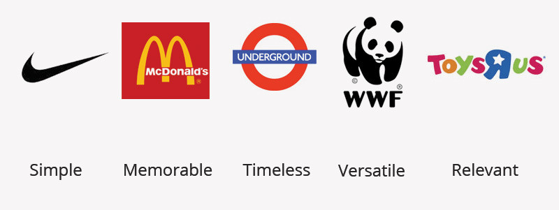
For a logo to be effective, it should be kept in mind that the logo should be distinctive, well-researched and appropriate for the company’s needs, goals, practical, simple, easily-remembered and most especially, it should convey the company’s intended message and essence. There are 5 main principles for creating an effective logo design for a company. Business owners and designer can learn from the tips below.
Five Principles of effective logo design are as follows:

Simple
In creating an effective logo design, all the concepts should be transformed to its simplest form, but the concepts should still be represented there. Keeping logos simple is the key to making it easily recognizable and makes way for the other principles, such as memorability and versatility. It is also very important for a logo to be simple because you want your logo to be used on all kind of material and sizes.
Memorable
When a logo is memorable, it builds a lasting impression of the brand/company. When people see memorable logos, they already know which brand it represents, just like McDonalds. When a logo is simple, then, it is easily remembered by consumers.
Timeless
lots of designer and business owners what their logo to be designed based on the current trends, which is not bad. In designing a logo, try to stay away from trends and try to make the logo timeless. Coca-Cola used their logo since their debut in 1885. Since its logo is not based on a trend, it still remained.
When you follow trends in making logos, as those trends fade, your logo will eventually fade as well. That is why in designing a logo, it should not only illustrate a strong concept but also made for long-term. the best way to create a timeless logo is to use shapes like Underground.
Versatile
Logos should be versatile in a sense that its design should be applicable to the company’s other forms and mediums. Remember that you are designing a logo that can be used in all the company’s needs such as business cards, advertisements etc. for thin lines and other small elements may disappear when used in smaller sizes.
Also, it would be better if you also consider printing costs in designing your logo. As technology changing, you have to think of a logo which is so simple that can fit or can be translated in a 16-pixel by 16-pixel favicon. Just like Nike.
Relevant.
The logo should be appropriate for the company’s image and should fit the purpose and identity of the company. whatever logo you design by using the above 4 principles you want your logo identity to speak to your end target audience.
For example, if your logo is not relevant to your company or type of business you are doing. Then, people might relate or miss understand your company with some other type of business and you might lose your potential clients.
These principles, combined with your idea and creativity, will surely make you come up with an effective logo for your clients or business. Also, ask these question when you have designed a logo.
- how does my logo look in one colour?
- In reverse colour (i.e. light logo on dark background)?
- How does it look on a business card?
- As large as a billboard?
Hope this information will help you with your logo identity project. Learn more about logo design type and its impact.

